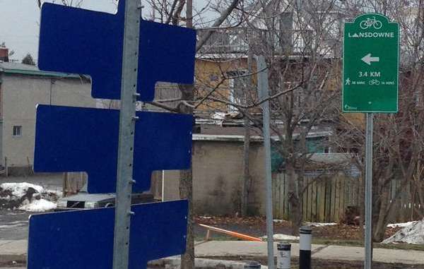
wayfinding in Ottawa has never impressed me. I remember there used to be a sign to Hull, I think it was on Bronson, about a foot square, that was covered by a tree branch for years, until the name ‘Hull’ ceased to exist. I am also often amazed that directional signs are put at the intersection or after an actual exit, rather than 200 meters before the exit. The photo below is a perfect example.

NCC wayfinding signs
Now the City of Ottawa is building a bike network, you might have noticed wayfinding signs starting to pop up. The NCC has had their own for a while, and they look attractive, but I think somewhat confusing sometimes, with both the name of the direction and the name of the final destination. Initially I didn’t grasp the two different purposes. Apparently, one of the arrows dropped off (as in the example underneath for the Arboretum) in some bureaucratic NCC directional sign sub committee.

From what I gather, there are directional signs (“Landsdowne – 2.2 km”), route name signs (“Rideau River Eastern Pathway”) or a combination of purposes, like the NCC signs that guide you to the Arboretum but also to side roads.
The NCC is consistent in its design but has also been experimenting with a very different system in the Greenbelt south of Bells Corners. The system originates in Belgium and is now mostly implemented in Belgium and the Netherlands as a wayfinding system for cycling and walking. Every major intersection has a number. Combined with a map or an app, you can simply find your way around by writing down the numbers of the intersections on a napkin. I will write more about that in a future post.
Node based wayfinding

City of Ottawa signs
But what has the City been doing? Well, not a very intelligent job. It appears that whatever department has a budget is allowed to put signs up the way they see fit. Currently there are 6 different styles within the City. Here is the proof:


Signs jungle
I am afraid it won’t take long before our paths are going to look like this:
Actually, it has started already:
Oddly, the NCC never mentions the Canal, a World Heritage site, as a destination when you cycle the Experimental Farm pathway. I don’t understand that. The canal pathways are also spine routes, so even more a reason to point people there for orientation. But then, there is still the humble Rideau Trail sign with its even humbler directional markers.
Where is the canal, Sir?
So my point is that I’d really like the City to come up with one logical design and one system. I also like to see the City and the NCC to at least connect their systems (sharing the same design is asking too much for sure): let’s think from a tourist/consumer/resident perspective rather than from our bureaucratic silos.
Pixo Design and wayfinding
I ain’t no expert in this, but Glenn Gobuyan is. He did do some project work for the NCC (the wayfinding system I described above in Bells Corners) and this is his company: PixoDesign. Glenn will be a speaker at our 4th annual Spring.Bike.Ottawa event on March 21. We often think of ‘supporting local companies’ in terms of beer and cupcakes, but Glenn has done some really interesting work. (Update: Glenn’s presentation was very well received by the 90 or so people at the event)
Dutch Paddenstoel
And did you know that there is a Dutch paddenstoel (mushroom) in Ottawa? They were the directional signs in the Netherlands for a long time and still are, more so in the South and East. The old ones were cast in concrete, the newer ones are made of a plastic material. Do you know where this one is in Ottawa? There is another one in Calgary, on the island in the Bow River. It was flushed away during the flood but will soon be replaced. I know that because I had the new one on my desk a few months ago. (Update, it was eventually replaced)


You might also want to check out my post with a subway style network map of cycling in Ottawa.
Discover more from Hans on the Bike - Cycling in Ottawa and beyond
Subscribe to get the latest posts sent to your email.


Have you seen the signs on the bike paths near the casino telling people to get off their bike and walk it over the bridges? There are also some on other bike paths that intersect roads, even quiet ones.
Imagine a sign telling a car to get out an push, or drive at 5kph.
Yes, which everyone ignores conveniently. I think those ones particular ones are there so you can’t sue the city if the bridges are icy and you slip. Luckily they are only advisory signs from what I learned.